When a face‑focused presentation slides into a boardroom, the way visual elements are arranged can make the difference between instant comprehension and a lost opportunity. Recent trends in template design emphasize a disciplined hierarchy—size, color, and placement that guide the eye from the most critical facial cue to supporting data. This guide unpacks the composition techniques that elevate face templates from decorative to decisive, offering concrete steps for researchers who demand precision.
Scenario: A conference speaker needs to emphasize facial expression analysis
Imagine a data scientist presenting a study on micro‑expressions in real‑time video feeds. The audience must first see a clear, high‑contrast image of the subject’s face, then move naturally to statistical overlays. By assigning the face a dominant visual weight—large size, central position, and a muted background—the viewer’s attention aligns with the core message before any ancillary charts appear.
Scenario: A marketing analyst translates customer sentiment into visual cues
In a quarterly review, an analyst uses a face template to illustrate sentiment clusters across demographics. Applying a hierarchical grid, the dominant facial portrait occupies the upper left “prime” zone, while sentiment icons cascade down in a diminishing scale. This approach mirrors the well‑known “Z‑pattern” reading flow, ensuring the most persuasive visual remains top‑of‑mind.
Actionable Steps for Building a Hierarchical Face Template
- Define the focal point. Start with a high‑resolution portrait, cropping to the eyes and mouth to capture emotional nuance.
- Set a visual scale. Use a size hierarchy—primary face at 60 % of slide width, secondary elements at 30–40 %.
- Choose a limited palette. Limit colors to three tones: a neutral background, a bold accent for the face, and a subtle hue for data markers.
- Apply whitespace deliberately. Reserve at least 15 % of the slide around the main face to avoid visual clutter and to reinforce focus.
- Integrate hierarchy cues. Employ contrast (dark outlines for the face, lighter lines for charts) and typographic hierarchy (large headline for the main insight, smaller body text for supporting details).
Scenario: A corporate trainer adopts ready‑made templates for rapid deployment
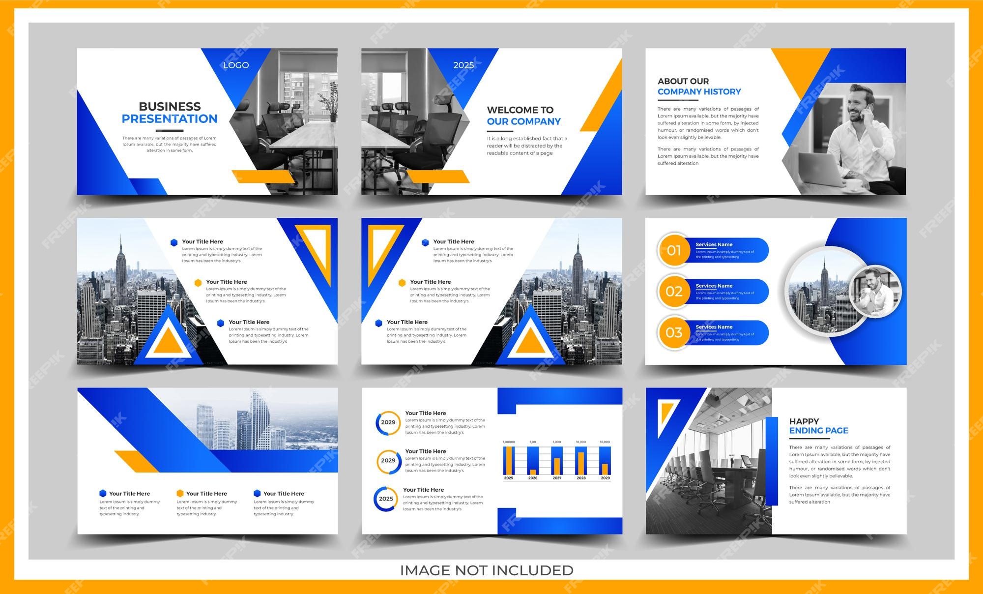
Corporate trainers often lack the time to craft custom layouts. Modern PowerPoint and Google Slides libraries now include templates that embody these hierarchy principles. The following visual demonstrates a template whose layout pre‑positions a face image, leaving space for bullet points and data visualizations:
Measuring Impact: From Visual Preference to Decision Influence
To validate the effectiveness of a hierarchical face template, researchers can employ eye‑tracking studies that record fixation duration on the facial region versus secondary charts. A 20 % increase in first‑fixation time typically correlates with higher recall of the presented insight. Additionally, post‑presentation surveys can quantify perceived clarity, giving a numeric benchmark for iterative refinement.
Scenario: An academic journal prepares a special issue on facial analytics
When assembling a multi‑author issue, editors benefit from a standardized template that enforces hierarchy across articles. Consistency not only streamlines the production workflow but also reinforces the visual credibility of the research, as each paper presents its core facial findings with a uniform emphasis.
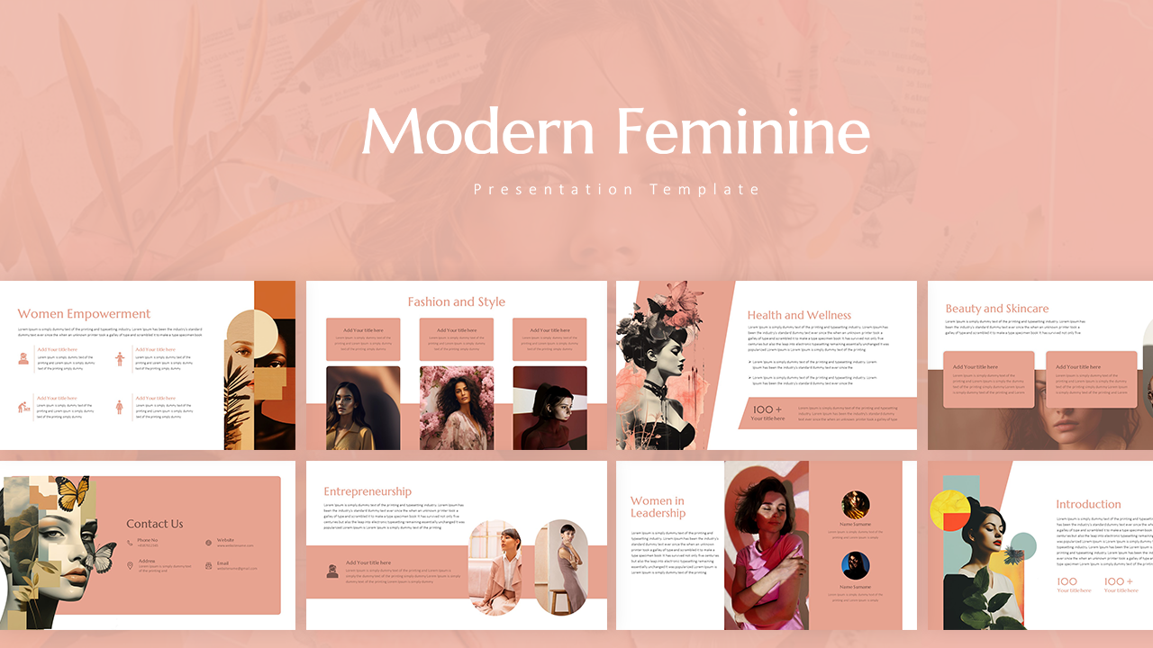
Tesla Theme PowerPoint Templates And Google Slides - SlideKit
Tesla Theme PowerPoint Templates and Google Slides - SlideKit
